With more and more people using smart phones to connect to the internet,
companies must adapt to the way go about their website design.
Recent data shows that over the past years, more and more people are visiting websites using their smart phones or tablets. Whereas the issue before was between static or dynamic websites, now it is all about responsive website design. The phrase itself mean a website that can respond not just to the need of the user but to the device they are using as well. Mobile device friendly responsive website design is now a requirement for achieving business goals from the internet.
If your company wants to join in on the trend, you first need to review what you have done with your website. If your website development team is not familiar with this, your best course of action is to consult professionals.

FOR BETTER USER EXPERIENCE
There is no substitute for improving your site user experience to increase visitor engagement with your site. Nowadays, a large amount of people browsing the web over mobile devices. That’s why, there have no substitute for responsive website, to convert your site visitors into your potential clients.
TO IMPROVE SEARCH ENGINE CREDIBILITY
Nowadays, search engines prefer mobile device ready websites. If your site is not mobile device friendly, then you normally lost the race of SEO before it started. And, if your site lags behind in search engine optimization, it is almost impossible to achieve business goals.

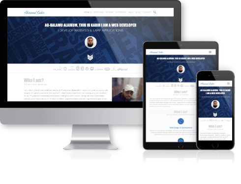
Responsive Portfolios


Convert Your Existing Non-Responsive Website to Responsive